
This week we thought we’d give you a little insight into Andy’s artistic process, his tools of choice and more specifically, his breakdown of Page 2.
So why Page 2? Take it away, Andy...
“Page two was the very first page I did for this issue. It seemed like the best opportunity for me to get comfortable with the character. On my second or third time reading the script, I write little notes to myself for each page and panel describing what I feel are the key aspects. So this page read something like: Splash. Bigfoot-sitting-armor-old/tired (I do this because if a script is super detailed, I could get intimidated and possibly confused. In the end, I'm not leaving any of the writer's direction out, I'm just creating a shorthand for it).
At this stage, I'm also looking for any sequence that jumps out at me for any reason at all. And the first three pages seemed like a fun way to get started.
LAYOUT:

Bigfoot: SOTE was the last assignment where I did all the work without digital assistance. Now I do everything but the inks digitally. The layout phase was usually done in a sketchbook or on a scrap of paper and with whatever pen or pencil I had on hand.
At this stage I'm having fun and trying to work as quickly as possible. Just so I don't find myself picking away at something that doesn't matter yet.
Since this page is of Bigfoot sitting on a rock, stargazing, I was able to knock it out pretty fast.
PENCILS:
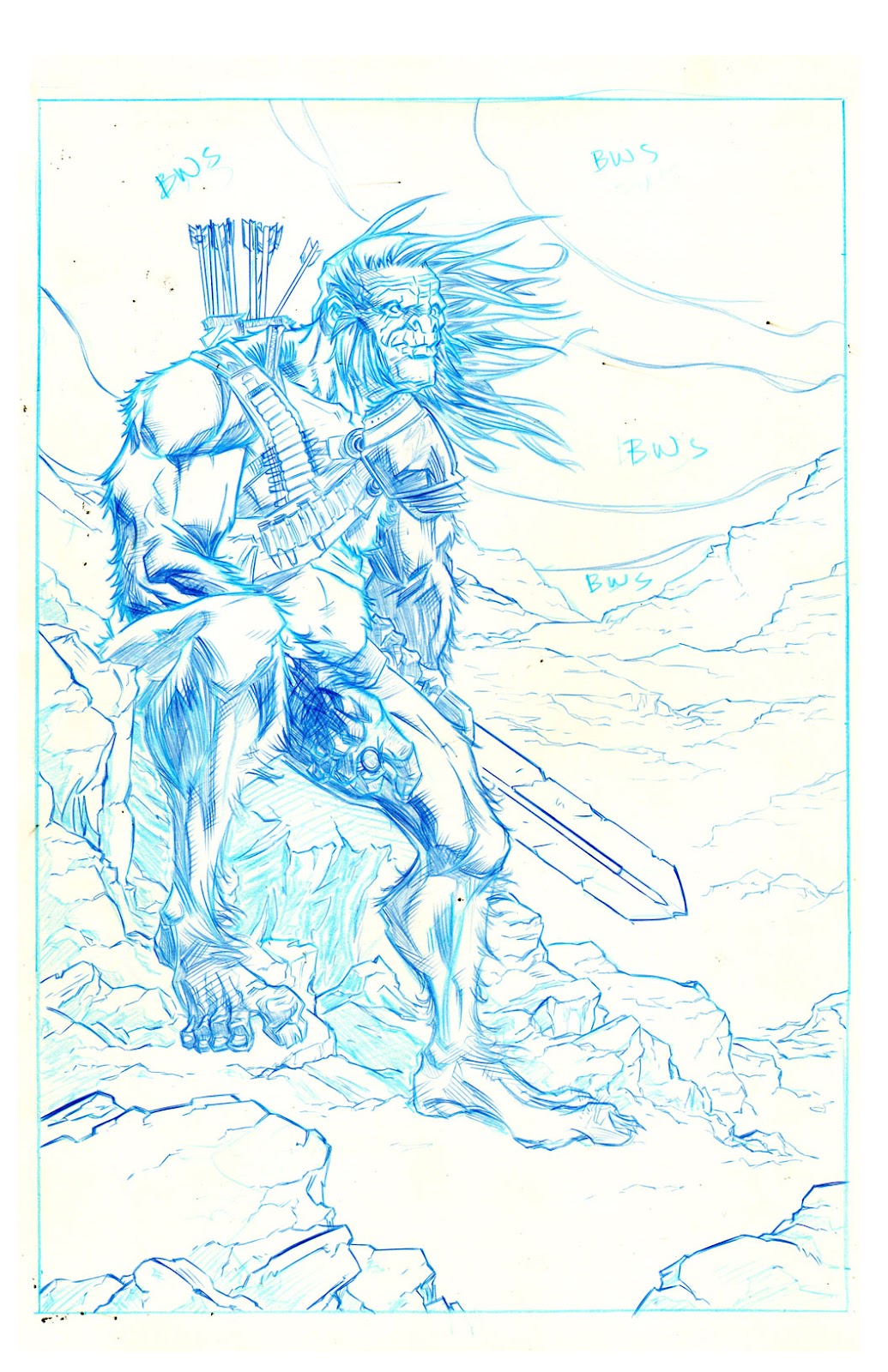
Once the layout is approved, I use the fancy printer I stole from my mother and print the image out on 11x17 inch, 3-ply, smooth bristol board. I like the smooth board simply because of the way the pencil feels on it and the style I use to ink my own pencil work. I use non-repro blue pencil solely due to the fact that I won't have to erase anything when I'm done.
My main focus is to have fun or at least give the illusion that I had fun. That's what I've noticed about the artists I admire most. There is no way for me to know whether or not they had fun, but their work always feels like they had fun. With this page, I had a lot of fun and finished it pretty quickly.
INKS:

Undoubtedly my favorite part of the process is inking. I have no reasoning why, it's just the most fun for me. Everything is laying there on the page and all I have to do is figure out how I want to finish it.
I loved using a No. 3 Raphael brush and various nibs, but unfortunately I'm so clumsy that I always found a way knock over my ink bottle and ruin pages, clothes and carpets. So now I almost exclusively use a Kuretake No. 55 Double Sided Brush Pen (Hard and Soft). I like it because the brush end is rubber-like and never loses its point. It's also super flexible, so you can get a significant line variation from it. And the hard side can fit all of your crow quill needs. One hundred per cent of this page was inked with that pen.
COLORS:

Tom [our colorist] is good at everything. We went to The Kubert School together and I became a big fan of his immediately. So when I got this job, his was one of the names I mentioned right away. He's someone that I knew would make me look better than I am and I'd probably learn a lot from. I never had many notes for him and was impressed with everything he did for this book."

========================
Excellent! Thanks for the insight, Andy! Down the road, we'll talk to Tom and get a feel for what it takes to make a page snap!
Until next time...
Have a good one,
Josh "Stuck with his Stick Figures" Henaman
No comments:
Post a Comment